About Us
The Artistry Behind Our Logo
The logo of the Synsint Research Group holds a special significance, as it was meticulously crafted by the renowned and globally recognized artist and graphic designer, Mrs. Leili Ghasemi from Canada.
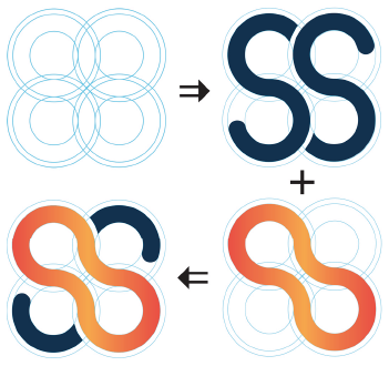
The concept behind this compelling logo seamlessly integrates two vital elements: the monogram of the original name, represented by two “S” letters for Synthesis and Sintering, and the sintering process, symbolizing the connection of powder particles. Leili’s creative vision has translated this concept into a form of utmost simplicity, ingeniously combining four circles to yield the final emblem.

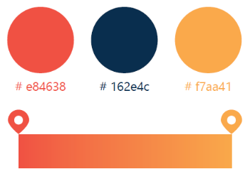
The color palette employed in this emblem conveys profound meaning: the vibrant yellow (#f7aa41) and bold red (#e84638) hues underscore the pivotal role of heat in propelling the synthesis and sintering processes forward. At the same time, the addition of navy blue (#162e4c) not only complements the aforementioned colors but also embodies the academic essence of the logo.

Moreover, the selection of Nirmala UI as the font for the design not only exudes simplicity but also harmonizes seamlessly with the overall composition, lending a sense of cohesion and balance.
Leili’s exceptional artistic prowess has brought the vision behind the logo to life, and her remarkable talent has added an indelible touch of creativity and depth to the identity of Synsint Research Group and the Synthesis and Sintering journal.

For those interested in exploring more of Mrs. Leili Ghasemi’s captivating portfolio or reaching out for her artistic expertise, you can connect with her WhatsApp at +1 (514) 995 3645, or her LinkedIn and Behance profile. Her passion and proficiency in graphic design are truly unparalleled, and she continues to leave an indelible mark on the artistic landscape.
